Help Wanted
Building 13 is a small Cincinnati-based graphic design company. When I say small, I mean, like, it’s just me. I rock web design, motion graphics, as well as print and branding design.
I am looking to bring on a talented (entry-level or associate-level) designer. Building 13 has found success working on a variety of project types and sizes. It’s a versatile company and I need a versatile designer with great communication skills and a constant willingness to learn. A good attitude, too. That’s a must. There isn’t a specific “type” of candidate for this position, but he or she might look a little something like this:
An all-around rock star designer that is comfortable working in multiple mediums (i.e. web and motion)
Or…
Someone who is a bit more skill focused — preferably in web design (front-end and some basic programming skills like php, rails or similar) or motion graphics (show me your reel!)
Or…
Maybe it’s someone else. Maybe it’s you. Tell me why you’re the designer that Building 13 needs. Show me what you bring to the table. Convince me you’re the ideal candidate.
Possible points of interest:
- I currently work out of my house in Mount Lookout.
- I’m not big on résumés.
- I’d like to see some of your best work (I prefer links over attachments).
- If you can show me how you think, that’d be pretty dope.
- My work samples can be found here: http://building13.com/ and here: https://vimeo.com/bldg13 (all kinda old stuff; hey, I’ve been busy!)
- Must love
dogsdog.
Possible perks:
- I’m down with you working remotely some (or perhaps all) of the time.
- I do have a nice ping pong table. It’s currently folded up here in the office, but that can be changed (will be tough to play if you work from home though).
If you’re interested, please shoot me an email: nathan@building13.com. Please send links to your work. Including salary expectations would be helpful too. Depending on the number of responses I get, I may not be able to respond to everyone.
Thank you for your time!
Fin.

22 months ago, I joined Nathan at Building 13 as a minority partner. This was the culmination of a goal established while I was an undergraduate at the University of Dayton - to own (or co-own) a design business at some point in my future career. While it was happening earlier than I had anticipated, the idea of being a business owner was extremely exciting. Partnering with a longtime friend and someone who I greatly respect and admire on myriad levels was the salted caramel icing on the proverbial cake. We hammered out the details, acknowledged the risks we both were taking, and talked openly and freely about what we needed to do to keep B13 moving on the steady upward trajectory Nathan had established the two years prior as a sole proprietor.
The acclimation to becoming a business owner was definitely a learning-on-the-fly situation. After nearly 7 years of my only responsibilities being delivering creative ideas and design, I was now trying to learn all the other responsibilities of business ownership on a 2 year delay from my partner. I give Nathan all the credit in the world for being patient with me as I attempted to learn about B13’s existing processes, and we worked together to form new ones as well. The juggling act of day-to-day business tasks with idea creation and design execution was a welcome challenge.
I understand that this next part is probably going to sound like some boo-hoo, woe-is-me, my-life-is-so-hard type shit. It’s me admitting that sometimes life overwhelms, mindsets change, and priorities shift.
The birth of my beautiful daughter in Sept 2012 brought even more responsibilities to my life’s plate that felt like it was starting to overflow. Reflecting back on it, that was the beginning of my mindset starting to shift in the direction of wanting B13 to be just work, a job where I could live out the aphorism “do what you love." The tedium of proposals and estimates and taxes and new business generation and x-y-z started to wear on me. I don’t think I fully realized that was the case until a year later, in the fall of 2013. In between, I tried to work hard and push through, even taking the reins completely for a month while Nathan went on his much deserved Epic Road Trip.
My naiveté about what it would actually take to run and grow a successful business coupled with major life changes all led to where we are now. Building 13 and I will be amicably parting ways as of today. Ultimately, B13 doesn’t fit with what I want professionally and what’s best for my growing family anymore. I absolutely don’t regret this experience. Being able to work alongside a great friend that is as driven and talented as Nathan has been tremendous.
Thank you, Nathan, for giving me the opportunity to help grow B13. I will always be proud to consider you a colleague and a friend. We may not have set the world on fire, but at least we survived mixing business and friendship, which in itself is no small feat.
The all new Building 13
It's Launch Day!
We currently live in a time of great promise, but also great upheaval, in the web design world, that is. From desktop to iPad to tablet to Android to iPhone to Blackberry (ugh), the many new facets of how a website must adapt are almost limitless and sometimes overwhelming. With the maiden voyage onto the information superhighway of building13.com (beta), we took our first crack at harnessing these some of these new facets and creating a great experience to showcase some of our talents.
Well, without further ado:
building13.com
Simplicity, usability & responsiveness were at the forefront of our design process. Below are some highlights of the site we'd like to explain a little more:
Intuitive Keyboard Navigation (desktop only)
While this style of navigation is fairly trendy on the widest world of webs at the moment, we fell in love with it and insisted on implementing it on our site. Right up top we explain the "rules of the game" so to speak, so they're easy for you to experiment with. While using this "new way" of navigation, we hope the user comes to the realization that the up-down + left-right arrow keys mimic those of the "swipe" motions in touch devices. We believe providing this makes a bridge to a more harmonious experience from desktop to iPad to iPhone. That doesn't mean you can't just scroll away with your mouse though... by all means, go right ahead.
Device Agnostic Design
Otherwise known as responsive web design, this philosophy seems to be a supremely polarizing one in the web design community. In our humble opinion, while there is a time and place for everything, RWD should be implemented as a strategic engineering approach, not just as a strict presentation solution. We wanted our site to adjust itself to compliment this changing environment in our field. This is a really important topic to us and the rest of the community. We look forward to chime in with some thoughts in the future.
We will continue to tweak and build upon this beta launch of our website, adding a project archive, search function and Spotify playlist (so you can jam with us) to name a few. In the end, if you like our work and enjoyed your experience navigating through it, we will be like this. Let us know what you think of the site, for better or for worse, below in the comments or hit us up on Facebook or Twitter. Thanks for your time in advance, cheers!
Mobile vs Retina
Evolution
While the web is certainly in a state of constant evolution, a seemingly pivotal transition period seems to be underway. One of the last more significant transitions was going from dialup to high-speed broadband during the early to mid 2000's. That evolution allowed higher bandwidth sites like Flickr and YouTube to flourish.
The latest evolution of the web does not come from the web itself, but rather the devices that we use to view it. Well, there are actually two parts to this evolution: mobile and Retina Displays (high pixel-density displays). And they seem to be, at least temporarily, at odds with eachother—more about this conflict later.
Mobile
Before Apple unveiled the iPhone back in 2007, mobile browsing of the web was, in hindsight, a total joke. Now, browsing the web on a mobile device can be an equal, if not superior, experience compared to on a laptop or desktop.
So, designing for the web is now a bit more complicated. It's vital for designers to create sites that perform well on all types of devices. This has led to creating mobile versions of websites and more recently, responsive websites. ((These are huge topics and we plan on sharing some thoughts regarding responsive sites in the future.))
Retina Displays
Without going into too much detail, here is a brief visual overview of what a Retina Display is:
Pixel Density
It's really pretty simple. Retina displays basically have 4 pixels jammed into the space that used to take up one pixel. This makes for really beautiful screens.

Physical Image Size
The same size image on a retina display would be half the physical size of the same image displayed on a non-retina display. To "counteract" ((I say counteract because without scaling 2x, any images used for navigation would probably be too small to be usable. Also, scaling 2x presents the image more than likely closer to the creator's original intent.)) this effect, the device's operating system automatically doubles the scale of images (and text).

The funny thing about retina displays is that when they display images ((Notice I mention images—as in static images. Videos, because they're "moving pictures" don't look nearly as bad)) that are not "retina" quality, the images look terrible.
Apple popularized the Retina Display ((Apple has labeled their high pixel density screens Retina Displays. That term, while really only refers to Apple's devices, seems to be sticking. So, I'll be using the term "retina display" in a more generic sense—say, anything with more than 220 pixels per inch. Sorry Apple.)) with their iPhone 4. Retina Displays are now availible on iPhone, iPad and most recently available on a MacBook Pro. HTC, LG, Motorola Mobility and others have followed suit.
Solutions
There are already several solutions to serve up high-resolution images to retina display devices. We even came across this which is very interesting, but seems a bit hack-y in execution.
At odds
The conflict between mobile and retina goes back to bandwidth. Mobile devices are increasingly showing up with retina displays. But for images to take advantage of retina displays, they must contain more pixels. More data. More kilobytes—megabytes even. This is a nightmare for the seemingly struggling carriers, and data plans they offer to the penny pinching consumers.
Our attempt to add to the solution
We thought we could add to the solutions ((We are using retina.js to serve up @2x images to screens with a 2x CSS pixel ratio and non-retina images to screens with a 1x CSS pixel ratio)) mentioned above by letting the user decide whether or not to display retina images. We present the user with the ability to toggle between retina and non retina images. With 4G/LTE still sparse and with limited data plans we decided to make the default set to show non-retina images. A simple toggle and the page refreshes with beautiful retina images.

You may notice an actual difference in the content of many the images—mainly images in projects tagged with web. Many of the sites we have designed are built at a static page width of 960px. So when we want to show these as retina images the 960px width doesn't fill the entire frame. So you'll just see a bit more background color. This just goes to show that the 960px width page is or is soon to be dead. #responsive
Still mobile
Apple's has indicated with it's latest MacBook that not only will our smaller devices sport Retina Displays, but, now, our primary workstations will too. The new MacBook is still very much a portable machine. So, bandwidth can be an issue especially if you're using your smart phone as your internet connection.
When Apple starts rolling out desktop workstations with retina displays, we might have to reconsider our approach. But for now, we think it's a dandy solution.
What do you think?
Design In Process
The last 20 months have been incredibly busy, but insanely awesome. I have been working my ass off developing relationships with some very cool clients and doing a lot of really great work for them that I'm extremely proud of. So far, it has been quite a rewarding adventure. However, during this time, I have had little time to spend on several vital aspects of not only the business but also in my own personal life.
As you can imagine, there are a lot of advantages to working for yourself, by yourself and at your own home. Limitations to this setup become apparent rather quickly though. Instant feedback is pretty much nonexistent. Other than clients, there is no one to challenge you or bounce ideas off of. This was a drastic change from the agency life where I had previously worked.
Late last year I began thinking seriously about bringing on another full time designer. I wanted to bring someone on who could really hit the ground running. Unfortunately, I was not at a point where I was financially comfortable with hiring the senior level designer that I knew I needed. The person I really wanted to bring on was currently employed and worth a lot more than I could afford to pay him. The only way I could persuade him to join my efforts was to offer a partnership in the company.
Enter, Keith Haun.
Keith and I met in June of 2005 when we both started working for a design agency in Mason, Ohio. He and I quickly became good friends. He was one of the main reasons I ended up moving to Cincinnati (from Dayton) a few years later. I met a lot of my current friends through him. I'm proud as hell to have him join Building 13 as my business partner.
Keith is a 2005 graduate from the University of Dayton's Visual Communication program. He brings with him a wealth of knowledge about web design and branding. I'm excited for Keith and I to show the world what the two of us together are capable of.
As I mentioned, my focus on developing the business side kept me from prioritizing other key areas of the business, namely marketing. The web presence of Building 13 is abysmal. When I first launched Building 13 I set up a Cargo Collective portfolio and have since have had only minimal updates. At a point last year I did have some short lived downtime and designed a new site and sent it off to be developed into a WordPress site. It got about 85% finished. I wanted to make several changes before launch and simply never got around to implementing them. It sits on a development domain and collects cob webs.
Now, with the added capacity, Keith and are able spend some time on promoting ourselves and our work. This post is the start of that promotion.
Updated Logo

We simplified the logo a bit. We won't hold ourselves to just 1 color for our logo, but for now, we really dig yellow.
New Site (teaser)

We are hard at work designing and developing a portfolio website. Here is a quick teaser of how it's coming along.
A Good Design Philosophy
Pinterest’s Founding Designer Shares His Dead-Simple Design Philosophy
Stop thinking about design in terms of wire frames or visual style; it is about the product as a whole. Designing is figuring out the purpose of your product and how you orient everything else around it. And that means that everyone within a company plays a role in the design process. And that means that everyone in a company needs to learn design literacy. It’s a hard task.
This is a concept that we can't stress enough to our clients. As more companies with strong design sense (Apple, Pintrest) become wildly successful, this concept becomes easier to justify.
A Brief History of Title Design
Love this:
http://vimeo.com/20759580
Plexus - First Test
Moved Upstairs
With one of the roommates (manmates) moved out, I decided to take the additional rent on and move my office into a bedroom. Some furniture from Ikea and some sweat (Taylor's, Clayton's and mine) and voila, office.

See larger at flickr.
Graphic design can change your life
Erik Spiekermann talking about graphic design, more specifically, type.
I found myself very inspired by this video. I especially like the part where Erik talks about government using poor design (tax documents, etc.) to separate us from the government by making us stupid—"we don't understand so we do what we're told." I think there is some serious truth in that.
Enjoy.
http://vimeo.com/19441320
7D 60p to 24p slow motion test
So I bought a 7D and a couple of lenses late last year to not only be able take great photos but also shoot some HD video. The 7D combined with some good lenses can make for some near cinema quality video. That being said, this video is neither "near cinema quality" nor decent story telling. It was, however, a simple test to see what is involved in shooting and conforming 60p video to 24p slow motion video. The lighting is terrible. The talent, while insanely cute, is not doing much. But it was fun. Mission accomplished.
http://vimeo.com/19461675
Canon 7D
Canon EFS 17-55mm 2.8
Shot at 60p
Conformed with Cinema Tools to 24p (see Phillip Bloom's post)
Edited in Final Cut
Color graded in After Effects
Shantui Concept Video
http://vimeo.com/18919294
Thanks to Kenny over at Showdown Visual for letting me work on this project. It was a lot of fun.
Motion Designer: Nathan Gross
Director: Kenny Mosher
Written by: VMA and Rachel Mosher
A 2011 Showdown Visual Production
The Future for Web Design?
If you follow Smashing Magazine, as I do, then you are probably familiar with last week’s highly commented articles debating what the future might have in store for web designers.
For your reference:
Does The Future Of The Internet Have Room For Web Designers? (original article)
I Want To Be A Web Designer When I Grow Up (follow up article)
Cameron Chapman suggests that due to the recent surge of mobile apps and other content curators (Google, Twitter, Facebook) the future for web designers is glum and that demand for web designers will wane.
It is an interesting topic and I wanted to add to the discussion with some quick thoughts:
Cameron might have had better luck with a slightly modified title: “Does the Future of the Internet Have Room for Web Design?”
Consumers will go where the best experience is. Look at the movie industry. Consumers found a better experience watching movies at home on their large HD screes, Blue Ray players, and Dolby surround sound. Theaters fought back with 3D… and now with 3D tvs at home, the battle continues. If you want to attract consumers to your website, create a better experience.
Generally, a good designer transcends multiple mediums or will evolve as necessary. If you consider yourself solely a web designer the possibility does exist that demand for you will disappear (see: typesetting).
Google is smart
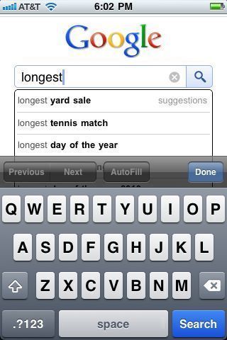
As I sit here watching the Djokovic/Federer US Open tennis match I was trying to remember how long the recent record breaking match (length of time) at Wimbledon was. I started my search query on Google with "longest" and Google suggested "longest tennis match" as the second suggestion.
I'm curious how that works. Is it based on other's recent searches? Or is there some sort of a current events algorithm?
Anyway, I'm impressed.
A brief observation of customer service
I just got back from Trader Joes—one of my new favorite places to grocery shop. I was once again thoroughly impressed with the customer service during checkout.
It went something like this:
Cashier: You can rest your arms (pointing at the open spot to put down my basket).Me: Oh, thanks.
Cashier: I like your shirt. (I was wearing my MuteMath concert T-shirt from a few years ago)
Me: Hey thanks!
After the transaction had been processed and the cashier was handing me my bag...
Cashier: Are you enjoying this weather?
Me: I sure am!
Cashier: Well continue to enjoy it...it's beautiful!
This was a very pleasant conversation. It was nothing out of the ordinary. It was, however, authentic.
Everyone understands that customer service is an important part of doing business—especially in retail. But a trend that is starting to annoy me is when everyone at an establishment says exactly the same thing. For example, if you walk in to a Chick-fil-A, everyone says "how may I serve you" or "my pleasure." This might seem pleasant at first but after awhile it comes off as artificial and robotic.
The lady at Trader Joe's was speaking to me as an individual and not going by any script. And for that...I thank her.
Nothing New
There is a lot of really great music out now. One of the things I've noticed over the last few year—and some might argue much longer— that so much music now sounds like some genre of the past.
Don't me wrong, though, I really dig what these following bands are doing:
Professionals, amateurs and...freelancers?
I really enjoy reading Seth Godin's Books and blog. If you're not familiar with Seth, I highly recommend reading his latest book, Linchpin.
In a post today he suggests hiring a professional—"someone who costs a lot but is worth more than they charge" or an amateur—"a talented person willing to trade income for the chance to do what he loves, with freedom rather than to get the job done." He then goes on to warn against hiring "someone who just thinks it's a job."
I wanted to add to that list—consider hiring a freelancer. While freelancers can certainly fall under the professional or amateur categories, I believe they can potentially combine the best of both.
When you hire a freelancer, you typically get a professional who is very passionate about his or her line of work—you have to love what you do to take on the risk of working for yourself. An independent freelancer has their name on the line and they will generally bend over backwards to get a steady flow of work from you. A freelancer also has very little overhead, allowing you to get great value for your money, when compared to hiring an agency. Note that freelancers typically maintain a network with other freelancers that they can plug in when necessary, making them virtually as strategic and versatile as agencies.
Updates
So much has happened since my last entry, especially within the last 5 weeks.
On July 22nd I was fired from my full time job (I will probably write more about this topic later).
I immediately set up my portfolio on Cargo. I also set up accounts on various sites like Behance, Elance, Facebook and others. I'm still in the process of updating all my portfolio sites. I can tell already it's going to be a pain to manage multiple portfolios. I may have to think about which sites I keep updated.
I reached out to some previous clients and some potential new ones. I talked to a lot of family and friends. My mom and dad have been very helpful. I got a lot of support and advice.
By the 26th I was up and running my own freelance business.
I have since landed a few clients and I continue working on a freelance basis with my previous employer. There is still a lot to do and people to call but things really seem to be falling into place.
Today I freshened up the blog with a new look. I downloaded the free theme called Modernist by Rodrigo Galindez. I made a few changes to the color and typography. While it's not my design, I am very happy with it. I'll probably keep tweaking it as I learn the ins and outs of a WordPress theme. When I feel I have it figured out I'll probably create my own.
I plan to make regular updates to this blog. Please stay tuned.
All in all, things are good.
Playing with Mograph/Dynamics/Cinema 4D
http://vimeo.com/9294253
Snow Leopard - Two Cool Things
Two cool things I noticed recently in Snow Leopard:
Finder can now "Quick Look" Adobe Illustrator files (as long as they are saved with the default PDF preview turned on). I'm not sure why this didn't work in 10.5 since Preview.app could already preview similar .ai files. Anyway, this makes me happy.
In screen sharing the thumbnail window is now a live preview. Before it seemed to just be a screen shot from the last moment you were in that window. The live thumbnail is great for several reasons. For example, you can see when a file transfer is completed without having to switch back and forth between local and remote full screens.
iTunes 9 - Home Sharing
I like that Apple has added Home Sharing in iTunes 9. It allows you to "sync" music, movies, tv shows, audiobooks and applications, with up to 5 computers in your house. It can automatically transfer new purchases of the mentioned file types—although only works with purchased files.
This works great for keeping my work iTunes synced up with my home iTunes. I just bring in my laptop every few days and sync it up. I wish they would add the ability to sync play counts and ratings.
I'm curious how it will work with mp3's that have had the ID3 tags modified from one library to another.
Elan Technologies - Web
Proposed site refresh for elantech.net.
[caption id="attachment_237" align="alignnone" width="525" caption="Proposed website refresh for Elan Technologies"] [/caption]
ADF Engineering - Website
Proposed site refresh for adfengineering.com.
[caption id="attachment_229" align="alignnone" width="525" caption="Proposed website updates for ADF Engineering - Home Page"] [/caption]
[caption id="attachment_228" align="alignnone" width="525" caption="Proposed website updates for ADF Engineering - Contact Page"] [/caption]
[caption id="attachment_232" align="alignnone" width="525" caption="Current site design - 2007"] [/caption]
The Renovo Bicycle - Renovo Hardwood Bicycles
Beautiful wooden frame bicycles by Renovo Hardwood Bicycles. Just gorgeous.
(via Keith Haun)
The next version of OS X?

Already rumors of the next version of OS X?
Thoughts on "Monopolies"
I was listening to TWiT #209 this morning. It really is a must listen to weekly podcast. However, I did find myself a little irritated when Leo and guests suggested Google is currently a monopoly and that Microsoft used to be a monopoly.
I believe they are simply referring to the majority of market share these companies own but I find the word is being used inappropriately more and more often.
It seems any large company owning a majority of it's market share gets flagged with the term. But owning a majority of any market is not a monopoly unless it maintains it's market share exclusively through legal privilege or a sort of outside controlled barrier to entry. Both of the companies mentioned operate in competitive markets. Consumers have multiple alternatives to both large companies.
I do understand the importance of competition and hope that more companies rise to compete against the Microsofts and Googles of the world. Competition almost always provides better experiences for consumers.
Texting while driving - Response to Jason Calicanis
Alternate Blinking Layers in After Effects
I was looking for a simple way to alternate 2 layers for a simple flapping cape animation.
I came across this expression to set a layer to blink. I figured out how to modify it for the effect I wanted.
Add the following expressions to opacity:
Layer 1
blinkSpeed = 2;
t = (Math.cos (blinkSpeed*time*Math.PI*2)+1)/2;
v = linear(t, 0, 1, 0, 1);
Math.round(v)*100
Layer 1
blinkSpeed = 2;
t = (Math.cos (blinkSpeed*time*Math.PI*2)+1)/2;
v = linear(t, 1, 0, 1, 0);
Math.round(v)*100
Notice the change to the "v=linear" number order.
I'm sure this is out there somewhere but I couldn't find it.
AudioBoo
This is basically just a soundcheck along with a quick note to my coworker, Jennifer.
iTunes Mobile
I don't like to carry all of my music, movies, tv shows, etc. on my laptop but since that's the computer I have with me most of the time, it has become the computer that I manage my iTunes library on. I would prefer be able to leave most of my 100GB+ library at home on my main workstation and just take a portion of my library with me at any given time. However, I don't want to manage multiple libraries.
I would like to see iTunes incorporate syncing of not only iPods, iPhones, and Apple TVs but also mobile devices like laptops and netbooks. The laptop/netbook would still have full blown iTunes installed. I'm thinking that you would set your main iTunes to "master" and your laptop/netbook iTunes to "mobile." Once set up, your main iTunes would see your mobile devices and allow you to sync similarly to syncing an iPod.
Modifying meta data in the mobile library might require a more robust syncing system like Apple's MobileMe Sync.
How well could this work? Am I missing anything?
XM Radio - XMU Playlist
It's great that I can listen to XM Radio on DirectTV. Unfortunately, artist and song info is not displayed. If interested in a song, I can usually Shazam the song using my iPhone to find out who it is.
Last night listening to XMU—about the only station I listen to on XM—a killer song came on. Shazam nor I could not identify it. I went to online to XMradio looking for tune info. By the time I found the XMU page the song had ended. The only info they seem to display is the current song—no previous songs list. I decided to hit up XM through their contact page. I filled out the appropriate info including "Programing" from the subject drop down and submitted this message:
I'm looking for a song that just played. It is now 7PM eastern time on Sunday April 5. The song was I believe 2 before Telekinesis - Great Lakes. Do you have a link to previously played songs? All I can find is current song.Thanks!
Nathan
This morning I received the following email response from Daine (irrelevant info omitted)
Dear Mr. Gross,Thank you for contacting XM.
We are happy to assist you with your song request. Unfortunately, The Email Team is unable to provide you with the information you requested but we can point you in the right direction. Please contact our Programming Department at programming@xmradio.com and a representative will be happy to assist you.
My response:
Daine,I selected "Programing" as the subject on your "Email Us" contact page. It seems strange that this would not be sent to the appropriate "Programming" people at XM. If my message did not make it to the appropriate people then it seems that good customer service would simply forward the question to the appropriate people.
Thanks anyway.
Nathan Gross
Dear XM,
Please post a previous songs list.
*Update* Thanks to ~JeZay~ I now have a source for finding songs played on XM/Sirius.
Bikes for Target - in stores now
[caption id="attachment_167" align="alignnone" width="525" caption="Schwinn S-60"] [/caption]
[caption id="attachment_166" align="alignnone" width="525" caption="Schwinn S-25"] [/caption]
[caption id="attachment_165" align="alignnone" width="525" caption="Schwinn - Fray"] [/caption]
*Update* These bikes were designed back in 2007. They have been available at Target for a while.
Rocket Science Logo in 3D Space
*Update* It seems that certain files on Vimeo play back very fast. If you watch the video a second time, it should play back at normal speed.
Playing around with our (Rocket Science + Design) new logo, in Adobe After Effects. Playing with CC Particle world thanks to Andrew Kramer over at VideoCopilot.
Ant Farm - Logo
[caption id="attachment_137" align="alignnone" width="525" caption="Antfarm Logo - black"] [/caption]
[caption id="attachment_138" align="alignnone" width="525" caption="Antfarm Logo - white"] [/caption]
Ball of Motion on Vimeo
*Update* The first time you view this video it plays really fast. But after that it seems normal.
I try to use a lens flare every chance I get. I created this seamless loop for a sales meeting for Ethicon Endo-Surgery
Huffy All Terrain Bikes
[caption id="attachment_126" align="alignnone" width="525" caption="26" Boys Lava"] [/caption]
[caption id="attachment_127" align="alignnone" width="525" caption="26" Boys Technica"] [/caption]
A couple of 26" ATB's I designed for Huffy.
Very Berry - Bikes for Huffy
[caption id="attachment_116" align="alignnone" width="525" caption="16" Very Berry"] [/caption]
[caption id="attachment_117" align="alignnone" width="525" caption="12" Very Berry"] [/caption]
I got to work on quite the range of bikes. These are about as cutesy as I go. Quite the rip-off of Strawberry Shortcake huh?
Huffy Tantrum
[caption id="attachment_112" align="alignnone" width="525" caption="20" Boys Huffy Tantrum"] [/caption]
[caption id="attachment_111" align="alignnone" width="525" caption="20" Boys Huffy Tantrum"] [/caption]
Two boys bikes I designed for Huffy.
Huffy Scooters
[caption id="attachment_107" align="alignnone" width="525" caption="Miss Racer"] [/caption]
[caption id="attachment_106" align="alignnone" width="525" caption="Boys Zoomer II"] [/caption]
[caption id="attachment_105" align="alignnone" width="525" caption="Girls Zoomer"] [/caption]
[caption id="attachment_104" align="alignnone" width="525" caption="Boys Zoomer"] [/caption]
A few of the kids scooters I designed for Huffy Bikes
More Girls Bikes for Huffy
[caption id="attachment_98" align="alignnone" width="525" caption="20" Miss Behavin'"] [/caption]
[caption id="attachment_97" align="alignnone" width="525" caption="20" Wicket Sweet"] [/caption]
[caption id="attachment_96" align="alignnone" width="525" caption="20" Miss Behavin'"] [/caption]
Girls bikes for Huffy
[caption id="attachment_88" align="alignnone" width="525" caption="18" Huffy So Sweet"] [/caption]
[caption id="attachment_89" align="alignnone" width="525" caption="18" Huffy n'style"] [/caption]
[caption id="attachment_90" align="alignnone" width="525" caption="19" Huffy Lunar"] [/caption]
A few of the girls bikes I designed for Huffy.
Blackwaters for Huffy Bikes
[caption id="attachment_80" align="alignnone" width="525" caption="26" Women's Huffy Blackwater"] [/caption]
[caption id="attachment_78" align="alignnone" width="525" caption="24" Women's Huffy Blackwater"] [/caption]
[caption id="attachment_79" align="alignnone" width="525" caption="26" Mens Huffy Blackwater"] [/caption]
[caption id="attachment_81" align="alignnone" width="525" caption="24" Mens Huffy Blackwater"] [/caption]
A series of graphics I created for the mens and women's Huffy Blackwaters.
Transcendia - Logo
[caption id="attachment_72" align="alignnone" width="525" caption="TranscendiaCM logo"] [/caption]
A logo I designed for a software company in 2005.
The Michael A. Doss Foundation - Logo
[caption id="attachment_64" align="alignnone" width="525" caption="The Michael A. Doss Foundation"] [/caption]
I created this logo for NFL star's foundation.
Ehrlich Campaigns - Logo
[caption id="attachment_57" align="alignnone" width="525" caption="Ehrlich Campaigns"] [/caption]
A logo created for Ehrlich Campaigns in 2006.
Cameras On Fire - Logo
[caption id="attachment_49" align="alignnone" width="525" caption="Cameras On Fire logo on white"] [/caption]
[caption id="attachment_50" align="alignnone" width="525" caption="Cameras On Fire logo on white"] [/caption]
Cameras On Fire was [still could be] a photoblog I created for my cousin Josh, friend Matias and myself to post some of our best work. In one year we posted 45 pictures. The last post was from October of 2007. I renewed the domain today in hopes to one day bring it back to life.
I created this logo in late 2006. It is mostly vector except for the reflection in the lens.
Old Content
The next few post will be previous [some old and some more recent] design projects.
SoundSource - Rogue Amoeba
*Update - Apple's Snow Leopard partially negates the need for SoundSource. Option-click on the volume icon in the menu bar (turn on in System Preferences) gives you quick access to your inputs/outputs. SoundSource still has a bit of an advantage by auto switching when you plug in headphones.
Working in an office environment I spend a lot of time listening to music through my headphones. When the time comes that I need to show something requiring sound I switch to my external speakers. This was a bit of process before—control + space, S Y S, return, sound, output, device.
Needless to say that I'm really stoked to have found this free app. from Rogue Amoeba - SoundSource. It puts an icon with a drop down menu on your menu bar. Sexy!
